Data visualization is a huge part of doing business today, with influence in so many different aspects. Whether it's in marketing through the dissemination of engaging information or corporate communications and pitches, there's a whole lot of value to be found in breaking down data into digestible chunks.
In today's article, we celebrate 12 of the best data visualizations ever made, illustrating the very best of what makes data visualization such an important tool.
Before we fawn over these gorgeous data viz examples, let's look at what makes them tick.
The most important function of data visualization is to help create insights from raw data, by making it easier to understand visually. In fulfillment of this function, great data viz examples often have these attributes.
3 Data Visualization Requirements
Shows Relationships Between Data
Looking at raw data in all its numerical, tabular, row-and-column glory is far from the most intuitive way to understand it. A good data visualization will immediately illustrate how data points are connected to one another and provide insights more quickly. Indeed, studies show that using data visualization tools can more quickly get you the information you need up to 28% faster, even.
Depicts Relationships Throughout Time
Depending on the application, a good data visualization can indicate patterns and trends across large data sets, showing connections that arise as time passes.
Tells A Story
The narrative style of presenting data in a narrative manner is gaining traction all over the world. A good data visualization will be able to use causality and storytelling to send a message that cuts clearly through the raw data, just like a moral in one of Aesop's fables.
12 Incredible Data Visualization Examples
Data visualization doesn't have to be merely utilitarian. There's certainly merit to creating beautiful and elegant data visualizations that can be appreciated just as much as works of art, as they are business tools. Indeed, they can benefit from a visual approach that draws attention and delivers its message effectively. Let's take a look at the highest examples of this.
1. Causes of Death: Google vs Media vs Reality

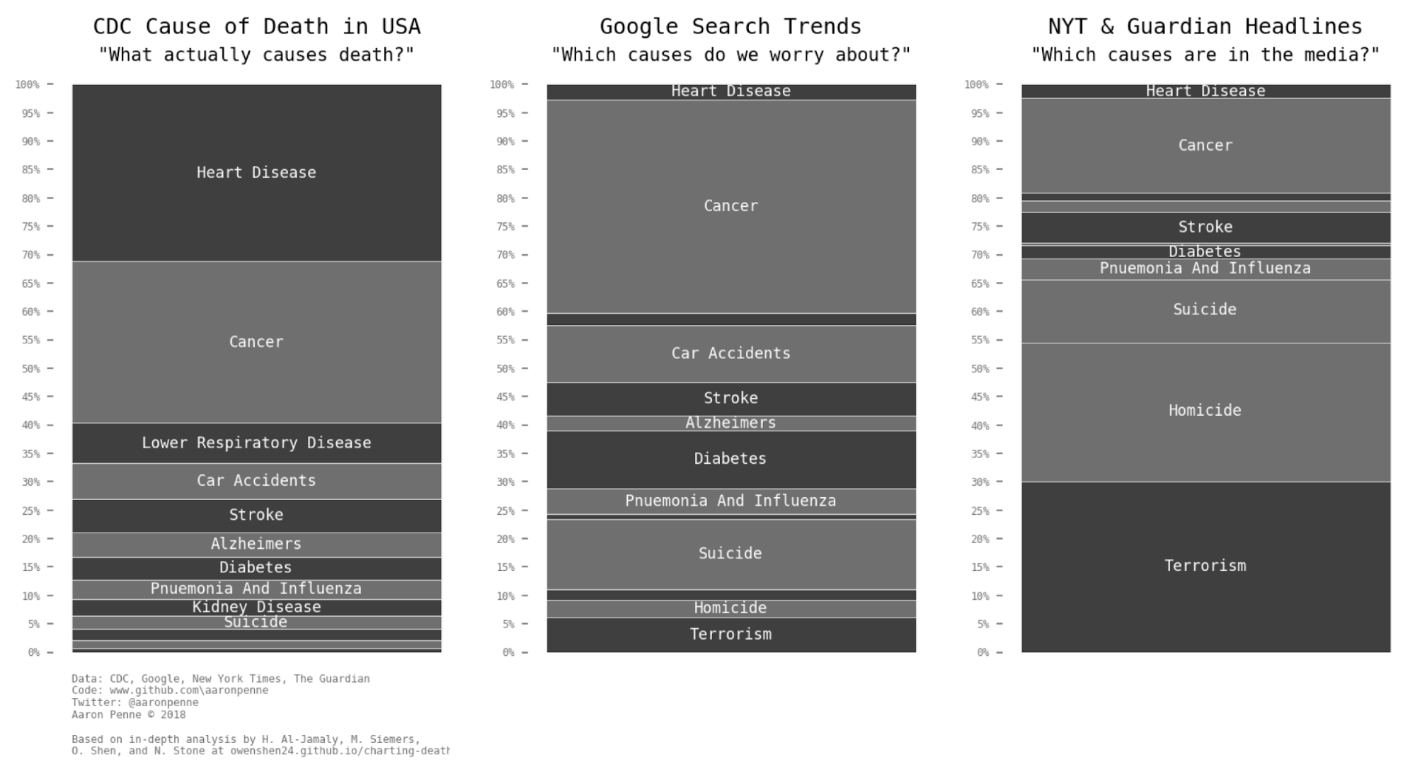
Image courtesy of Aaron Penne
First on our list is a particularly elegant visualization by data scientist Aaron Penne. Using various data from the CDC, The New York Times, Google Trends, and The Guardian from the years 1999 to 2016.
Penne created an animated stacked bar graph that compared the various causes of death based on their actual occurrence rate, how often they're searched, and how often they're reported in the media. The result is a sobering depiction of our priorities, stacked against how deadly they really are.
Penne's animated chart is currently the top post of all timeon the subreddit r/DataIsBeautiful, and while it's not particularly visually impressive, it tells a remarkable and effective story in a concise and easily-understood fashion showing that beauty is sometimes found in the simplest things. You can check out the original animated gif here.
2. How To Build A Human

Image courtesy of Eleanor Lutz
The miracle of life can hardly be expressed through static timelines and sketches, so digital artist and University of Washington Biology Ph.D candidate Eleanor Lutz decided to depict it in the form of an educational animation. Using 396 individual frames, Lutz shows the formation of a child, from fertilized egg cell to embryo, all the way to fetus and birth, in a gorgeous animation that spirals down through the stages of life. You can view the original animation at Lutz's infographic blog, Tabletop Whale.
3. Emoto2012


Image courtesy of emoto
One of the most unique data visualization examples ever presented, emoto expertly blended art installation and data visualization in a way that's hardly ever been done before. The emoto project aimed to depict the social response to the London 2012 games and comprised several visualizations, including an interactive online visualization that showed topics and tweets in real time, as well as a full research report.
However, the centerpiece of the project was an art installation that consisted of a series of physical sculptures, onto which heat maps for various topics were projected using projection mapping technology. The result was a stunning three-dimensional timeline view of emoto's data that provided a uniquely tangible way of seeing its insights.
You can check out emoto at the project web site.
4. U.S. Gun Deaths


Image taken from Periscopic
The topic of gun control is incredibly sensitive, and neither a purely data-driven approach nor one that appeals to emotion will be able to tackle this subject in an appropriate manner. Data visualization firm Periscopic decided to combine both approaches in an amazing interactive visualization that shows gun deaths through a unique form of data storytelling.
Their powerful infographic starts with a single life, represented by a line proceeding along in a trajectory that somewhat resembles that of a bullet, which is suddenly cut off by a shooting death. The infographic opens up wide and thousands of lines shoot out from the origin like a hail of gunfire, every life cut short and a counter of stolen years a notation of how long these people would have otherwise lived soars towards hundreds of thousands of years.
Periscopic's infographic is a strong example of how data storytelling can appeal to both reason and emotion at once in a balanced approach to sending a message. You can look at the full site and view the infographic here.
5. Wildfires in California


Image courtesy of Michael Mixon
California wildfires are well-known for their severity and disastrous results, owing to the state's heavy forest cover, dry and hot climate brought about by anthropogenic climate change, a large number of dead trees, and a variety of other contributing reasons. As of October 2018, almost 7,000 fires have caused nearly $3 billion in damage.
To illustrate this devastation, Seagate's Michael Mixon put together what appears, at first glance, to be a simple bar graph-type infographic. Clearly, the height of each bar represents the area that was burned, and the bars are stylized to look like rising flames and smoke.
However, closer inspection reveals far more than meets the eye each strand of fire within each bar is actually an individual fire, with a relative length that indicates how long the fire burned for, and relative thickness that indicates how many acres were consumed in each fire.
Elsewhere in Mixon's infographic, a Gantt chart resembling the geography of California presented a timeline to showcase fires that occurred in individual years, as well as the acres that each fire burned.
You can check out a detailed explanation of Mixon's work on his blog entry on the subject. You can check out the interactive infographic in full over at its Tableau page.
6. Rivers of Plastic

 Image courtesy of John Nelson
Cartographer John Nelson loves old-style maps and deeply cares about the environment. So, he broke out some old map textures, a font inspired by encyclopedias and circulars of the day, and some data about the top-contributing rivers in plastic emissions. The result is his Rivers of Plastic infographic, which looks like something straight out of the 19thcentury, while transmitting a very modern message of sustainability.
Check out the original infographic, plus additional information about its origins and creation, at Nelson's blog.
7. The Daily Routines of Famous Creative People

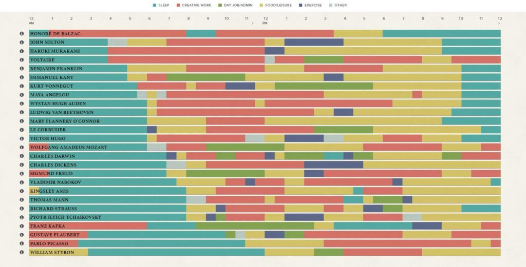
Image courtesy of Podio
How did the famous creative people of history manage their time? This is certainly an appropriate question to ask for project management service Podio, who put together information from Mason Currey's book,Daily Rituals, to create this elegant infographic that certainly suits their brand. Activities are organized into categories Sleep, Creative Work, Day Job/Admin, Food/Leisure, Exercise, and Other and arranged on a 24-hour timeline.
Of course, given the diversity of creatives that Podio featured composers Tchaikovsky and Strauss share screen space with authors Vonnegut and Hugo, and philosophers Kant and Voltaire it's to be expected that everyone had different ways of living each and every day. To illustrate that, Podio's infographic lets you filter out each category of activity, and see how everyone stacks up.
Check out the complete interactive infographic over here.
8. Selfiecity


Image courtesy of Selfiecity
While we might think of selfies as a modern phenomenon, self-portraiture is a time-honored artistic representation that dates back to the time of the Renaissance, when mirrors were becoming more affordable and reflective, and a great number of art history studies have been conducted on the styles and techniques associated with creating an image of oneself, whether sketched or photographed.
With Selfiecity, the modern art of self-portraiture is analyzed with the finest of data visualization processes. Over 120,000 Instagram photos, taken in New York, Sao Paulo, Berlin, Bangkok, and Moscow, were selected. The set was culled into a working set of 3,840 images that were analyzed using facial recognition software for eye position, angle, facial expressions, and other important visual attributes. The result is 640 photos for each city, demonstrating age, pose, features, position, mood, and other data points, that can be explored in an interactive Selfiexploratory section.
Check out the Selfiecity project here.
9. Winds & Words

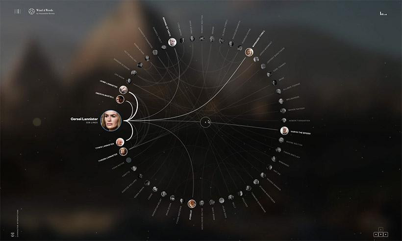
Image courtesy of Impossible Bureau
Even non-fans know that the TV seriesGame of Throneshas hundreds of named characters that have complex interactions with each other over the course of dozens of episodes. To illustrate this complexity, Impossible Bureau painstakingly scraped dialogue from the first six seasons of the show, tagged each line with emotions and sentiment, and attributed it to the characters who spoke it, creating a massive data set of dialogue in the process.
From the primordial sea of this data, Impossible Bureau createdWinds & Words, an interactive data visualization of every line spoken in the first six seasons, showcasing exactly how each named character interacts with each other, demonstrating the average positive or negative sentiments associated with each character, and even a tool to see how many times a word was said throughout the entirety of the data set. It's quite impressive, really, and beautifully done.
Head to Winds & Words to see the very pinnacle of personal investment in a TV series oh, and one of the most beautiful data visualizations, of course.
10. Olympic and Commonwealth Games' Medal Maps


Image courtesy of Zyan Consulting, Ltd.
Radial data visualizations have been all the rage lately, but they can be difficult to understand at times especially if used inappropriately.
Enter Zyan Consulting's series of radial maps, which shows the Olympic medals won by each country in their whole history in the Games. Each band is a single Olympic Games, divided into radial sectors for events and sports, and medals won in each are denoted by colored circles. It's easy to understand and offers a great deal of at-a-glance information without being too cluttered.
View the rest of Zyan's radial maps here.
11. How Gay Marriage Finally Won In The U.S. Supreme Court

Image courtesy of GOOD
LGBT individuals, along with their straight and cis allies all over the world celebrated during the 2016 landmark ruling that legalized gay marriage.
The fighthas been going on for decades, but the judicial battle that got the legal ball rolling started in 2006. GOOD's infographic presents milestones in the fight for gay marriage in a beautiful rainbow timeline, celebrating love and the people who helped give it the recognition it deserves.
View the full-size infographic at GOOD here.
12. Arctic Sea Ice Extent


Climate change is a real problem with real data backing it up. Data visualization engineer Adam Crahen produced a simple but beautiful interactive infographic to show some of this data in an easily understood way, illustrating the decline of the Arctic Sea Ice extent from 1989 to 2017.
Itself somewhat resembling a field of ice in an azure sea, the infographic depicts each day of each year as a colored region, discussing the total area of Arctic sea ice in the world at the time, as well as how it compares to the yearly median.
View the infographic here.
Conclusion
These data visualizations illustrate a very important lesson.
I guarantee that if you were to be provided the data in its spreadsheet form, you'd forget the majority of the information. In a visual format, data becomes an agent of change that impacts how we interact with facts.
At TapClicks, we realize the importance that visualization has on data from a myriad of channels. If you're convinced that if you could just simplify and aggregate all of your data, you would function better as a business, then I suggest you check out how TapClicks can solve some of your agency pain points.
Let us know what you think about the data visualizations. What do you think visualization does for businesses data?